Create a stunning dual axis chart and engage your viewers

A dual axis chart combines a column and line chart and compares two variables. Learn how to make a dual axis chart using Infogram's easy-to-use chart maker.

Try Infogram for free
4.5
140 reviews
interactive_dual_axis_charts

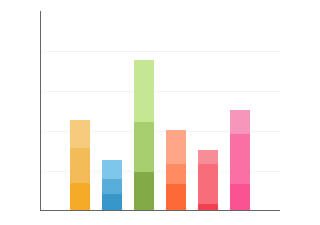
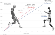
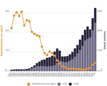
A dual axis chart (also called a multiple axes chart) uses two axes to easily illustrate the relationships between two variables with different magnitudes and scales of measurement. The relationship between two variables is referred to as correlation.

A dual axis chart illustrates plenty of information using limited space, so you can discover trends you may have otherwise missed.

With Infogram, you can quickly create an interactive dual axis chart for your business or personal use. It's easy to get started. Just choose a dual axis chart template created by our designers. Adjust the colors and text, upload data, and engage your audience from the first glance. 

Read on to learn more how to make a dual axis chart online using our easy-to-use chart maker. Don't worry, we're handling the complicated pieces, allowing you to focus on making engaging, interactive, and educational content that makes an impact.

Everybody Love Infogram

Many of our clients are excited by the service that we deliver.
Read about what some have said about us.

“ With Infogram we turned our service reporting into the cutting-edge category and receive amazing feedback from the user community. ”

Andreas Igler

Andreas Igler
Director of IT & Operations

“ I’m a data nerd, so I love tools that help readers better visualize information. We use a tool called Infogram at TechCrunch for data visualization. It’s super-easy to use, and you don’t have to be a data analyst or graphic designer to use it. ”

Travis Bernard

Travis Bernard
Director of Audience Development

“ Infogram has taken our stats to the next level. It's great to be able to upload a spreadsheet and turn it into a beautiful interactive piece for our clients to enjoy. ”

Kris Carpenter

Kris Carpenter
Director of Marketing

Browse all dual axis chart templates

Want to get started right away and create a dual axis chart for your website, blog, or project? Choose our ready-made dual axis chart templates to stand out from the sea of “meh” content. Keep it simple and create a professional-looking chart in seconds.

Column Chart
Column Chart
Line Chart
Line Chart
Table Chart
Table Chart
Pictoral Bar Chart
Pictoral Bar Chart
Radial Chart
Radial Chart
Semi circle Chart
Semi circle Chart
Funnel Chart
Funnel Chart
Column Stacked Chart
Bar Chart
Bar Chart
Pie Chart
Pie Chart
Wordcloud Chart
Wordcloud Chart
Doughnut Chart
Doughnut Chart
Pictoral Chart
Pictoral Chart
Column Grouped Chart
Bar Stacked Chart
Bar Stacked Chart

Frequently asked questions

How do I register an account?

1. Click on the Get started button in the top right corner of the homepage.

2. Sign up with Google, Facebook, or email. If you choose to sign up with Google or Facebook, simply login to your account when asked to do so. If you wish to sign up with your email address, enter the email and your desired password, then hit the Signup button.

3. Provide some basic information about yourself. Enter your first and last name, indicate what kind of organization you belong to, and specify your role. You will then be able to continue with the Basic plan or choose from any of the available paid plansView more

When do I use a dual axis chart?

With a dual-axis chart, you are essentially combining multiple charts and adding a second Y-axis for comparison. Some members of the data visualization community are skeptical about the use of dual-axis charts because they can often be confusing, poorly designed, and potentially misleading for the viewer.

However, if you have limited space and want to quickly establish the relationship between two variables, the dual-axis chart might be the right fit for you.

How do I create a dual axis chart?

Infogram's dual-axis chart creator allows you to quickly make a radial chart in just 5 steps:

1. Log in to Infogram

2. Select a dual-axis chart type (column and line chart, dual-line chart, grouped column and line chart, or stacked column and line chart)

3. Upload or copy and paste your data

4. Customize colors, labels, and fonts

5. Download your dual-axis chart or embed it on your website

Infogram is super easy to use and made with non-designers in mind. Even if you don't have any programming, coding, or design experience, you'll be able to make a dual-axis chart in just a couple of steps. 

We did all the technical work for you. Now, all that's left to do is start creating.

What are some best practices for creating dual axis charts?

Here are some general tips to keep in mind to make a dual axis chart like a superstar:

1. Make sure your Y-axes are related. Dual axis charts can be useful when comparing values that have different units of measurement because the things they measure are somehow related in a meaningful way. So make sure both axes are helping you tell your story effectively.

2. Place primary Y-axis on the left. We are hardwired to look at the Y-axis on the left first. Make sure your more important variable is placed there.

3. Use contrasting colors. Color-code your dual axis chart to make it easier for people to understand the data sets you have plotted. Try using contrasting colors so they are easy to distinguish from one another.

4. Give diversity to your data. For example, you can use a dual axis chart to compare revenue and units sold, price and volume, or rainfall and temperature. If you use similar units of measurement (for example, monetary values), make sure both Y-axes are scaled differently.

5. Avoid clutter. Don’t compare more than four variables when creating a dual axis chart.

6. Correlation does not always equal causation. Other factors may have influenced the data and gone unnoticed.

How can I style my dual axis chart?

You can customize any dual axis chart to your liking. Pick the right color palette and font, adjust the labels and icons, and even add animations. To edit your chart, click on it, then go to Settings and make the necessary changes.

Didn't find the answer? Check our FAQs