Create interactive bar charts to make a lasting impression

Create interactive bar charts or bar graphs in minutes with our easy to use bar chart maker. No design or coding skills required. Easy to use. A variety of designed templates.

Try Infogram for free
4.5
140 reviews
interactive_bar_charts

When presenting data, it’s important to use the right type of chart or graph. For example, bar graphs or bar charts are effective when you need to show specific trends or changes over time. 

However, bar charts can often be static and uninteresting. That’s why Infogram provides options to customize and create interactive bar charts and bar graphs. Upgrade your charts by adding more information when you scroll over data points or by adding custom animations. Then publish your data online to keep your audience engaged with your content longer and help them learn at their own pace - a win-win for everyone.

Read on to learn where to use interactive bar charts, the types of bar graphs you can create in Infogram, how to get started, and frequently asked questions. Don’t worry, we’re handling the complicated technical pieces, allowing you to focus on creating engaging, exciting, and educational content that will delight your customers.

Explore bar graph types

Once you’ve researched and come up with a great data-driven story, you’ll need to present it. Infogram offers endless ways to create captivating bar charts in minutes to tell your story more effectively than words or photos. Here you will find a guide that briefly explains when to use what.

Everybody Love Infogram

Many of our clients are excited by the service that we deliver.
Read about what some have said about us.

“ With Infogram we turned our service reporting into the cutting-edge category and receive amazing feedback from the user community. ”

Andreas Igler

Andreas Igler
Director of IT & Operations

“ I’m a data nerd, so I love tools that help readers better visualize information. We use a tool called Infogram at TechCrunch for data visualization. It’s super-easy to use, and you don’t have to be a data analyst or graphic designer to use it. ”

Travis Bernard

Travis Bernard
Director of Audience Development

“ Infogram has taken our stats to the next level. It's great to be able to upload a spreadsheet and turn it into a beautiful interactive piece for our clients to enjoy. ”

Kris Carpenter

Kris Carpenter
Director of Marketing

Browse all bar charts templates

Ready to make your own interactive bar chart? Infogram has over 200 customizable templates. We recommend browsing this selection for inspiration; you’ll be amazed by the options and places you can take your content.

Column Chart
Column Chart
Line Chart
Line Chart
Table Chart
Table Chart
Pictoral Bar Chart
Pictoral Bar Chart
Radial Chart
Radial Chart
Semi circle Chart
Semi circle Chart
Funnel Chart
Funnel Chart
Column Stacked Chart
Bar Chart
Bar Chart
Pie Chart
Pie Chart
Wordcloud Chart
Wordcloud Chart
Doughnut Chart
Doughnut Chart
Pictoral Chart
Pictoral Chart
Column Grouped Chart
Bar Stacked Chart
Bar Stacked Chart

Frequently asked questions

How do I register an account?

1. Click on the Get started button in the top right corner of the homepage.

2. Sign up with Google, Facebook, or email. If you choose to sign up with Google or Facebook, simply login to your account when asked to do so. If you wish to sign up with your email address, enter the email and your desired password, then hit the Signup button.

3. Provide some basic information about yourself. Enter your first and last name, indicate what kind of organization you belong to, and specify your role. You will then be able to continue with the Basic plan or choose from any of the available paid plansView more

Where to use interactive bar charts?

Interactive bar charts have a place in online presentations, slides, social media posts, reports, and ebooks. Across multiple industries, whenever you have to compare categories of information to show trends and changes over time, a bar chart is an effective way to tell that story. 

Using interactive bar charts elevates the experience by allowing viewers to move their mouse over key data points and learn more about those specific findings. This chart shows the different sources that generate electricity and how, over time, those sources change. By allowing the user to drag their mouse over data points, and adding select animations, what would normally be a run-of-the-mill chart is elevated and more engaging to viewers.

How do I create a bar graph?

You can make a bar graph in 5 easy steps:

1. Join Infogram to make your own bar graph.

2. Select a bar graph type (bar, column, stacked, grouped, radial, or progress).

3. Upload or copy and paste your data.

4. Customize labels, colors, and fonts.

5. Download your bar graph or embed it on your website.

What are the best practices for creating bar charts?

1. Label the axes to give your viewer context.

2. Put value labels on bars for easy reading.

3. Avoid using a 3D perspective or shadows as it makes your data difficult to see.

4. Use one single color or varying shades of the same color. You can also highlight one column in particular if that is the main message you want to convey.

How do I show chart values?

If you shared or embedded your chart online, anyone can see the data behind each bar, column, line, or pie slice in your chart by simply hovering over it with the mouse. However, some charts allow you to display the values inside the chart itself. This can be useful if you plan on downloading your chart as a static image or a PDF file, where interactivity is not supported.

To display values in your chart:

1. Click to select your chart.

2. Expand the Chart properties tab in the right sidebar

3. Enable the Show values option.

In column and bar charts, you can also choose to display the values outside of the bars and columns. Enable the Show values outside option in the right sidebar

Sometimes the values will not display even when the Show values option is enabled. This happens when there is not enough space to display the values within the bars or columns. In these cases, you need to increase the chart size.

In single chart or map layouts, this can be done by increasing the width of the infographic.

In pie charts, the option to show values is called Show callouts. You can also display the category name next to the value by enabling the Callout name option. You can automatically calculate what the variables represent in percentages, by enabling the Callout percentage option.

View more 

How do I create live-updating charts and maps?

With Infogram, you can create dynamic charts and maps that update live and in real-time. We support two integrations for live updates:

1. Google Sheets

2. A JSON feed

As soon as the data changes in the Google sheet or JSON file, the chart or map it is linked to will automatically update, even if it’s embedded.

Note: Infogram doesn't support formulas, only raw data. If you use formulas or other scripts in your Google sheet, the calculations may not show on Infogram after the import.

To create a live-updating chart or map via Google Sheets:

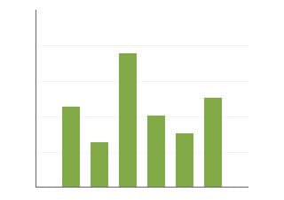
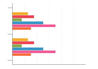
1. In a project, click the Add chart (or Add map button) in the left side panel and choose the chart type that best fits the information you want to display. If you are not sure which one to pick, try adding any chart type to your project and double-click it to review the example data. Use this data layout in the Google sheet you want to import into a chart.

Tip: Most Infogram charts can only display numeric data (line, column, bar, pie, bubble, etc.). However, some are designed to display text information as well (word cloud, treemap). If your data source contains some columns with numbers and some with text, you will need to:

Separate textual ones and visualize them in their own text-based chart or import the data into a Table chart that supports numbers + text inside one chart.

2. Double-click the chart to open its editor. Above the data table, you will see data import buttons. Choose to Add a Google Drive document. 

3. Connect your Google Drive account. All Google sheets will be displayed in the list.

Pro tip: You can remove Google Drive and Infogram integration via the Google account settings. When you do, existing live-updating charts will lose their connection.

4. Choose the spreadsheet with the data you need from your Google Drive.

5. When you edit information in your Google sheet, it will automatically update in your Infogram chart. The chart refreshes data every 30 seconds to a minute. These changes will automatically apply to your embeds and shared URL link.

Note: When changing the order of tabs in a Google sheet, the tabs will not automatically shift in your Infogram project. Each data tab of your Infogram project draws information from the numerically corresponding tab in the Google sheet, therefore you have to manually rename the tabs in your Infogram chart.

To create a live-updating chart or map via a JSON feed:

1. Add a chart or map to your project canvas by clicking the Add chart or Add map buttons in the left side panel.

2. Double-click the chart to open its editor. Above the data table, you will see data import buttons. Choose the Add JSON feed option.

3. Use this example to understand how to format your JSON feed. To create a multi-tab chart or map, use the following example. 

4. Now, when you edit the information in your JSON feed, it will automatically update in your Infogram chart. The chart refreshes data every 30 seconds to a minute. These changes will automatically apply to your embeds and shared URL link.

View more 

How do I add data to a chart?

Each chart comes pre-populated with sample data to show how data should be formatted when it's inserted into the chart. To add data to a chart, you can:

1. Copy and paste

2. Import via integrations

To add data by copying and pasting:

1. Click the Add chart icon on the left side panel and select the chart you wish to use. Drag and drop it into the editor. 

2. Double-click to access the chart's data table

3. Select a cell and start typing or use keyboard controls

 A. CTRL/CMD+C to copy

 B. CTRL/CMD+X to cut 

 C. CTRL/CMD+V to paste

 D. CTRL/CMD+Z to undo the last edit

4. Right-click a cell to access a menu with styling options:

Note: The option Add/change a link will require you to have a Business subscription or higher

To import data into a chart: 

Alternatively, you can import data into charts from your computer, Google Drive, Dropbox, OneDrive, or databases. Infogram supports the following formats: .xls, .csv, Google Sheets, JSON, and databases

Note: Infogram doesn't support formulas, only raw data. If you import data from Excel, make sure it has only plain data in the cells, as the formulas won't work on Infogram.

1. Double-click to open the chart's data table

2. Use one of the file import buttons above the data table. 

The first time you do this, you will need to authorize Infogram's access to some of your external data sources (Google Sheets, JSON, databases), where a connection needs to be created for live updates. Read more in the article about creating live-updating charts and maps. All other sources (your computer and Dropbox) will only allow importing files. Each time you wish to update your project you will have to re-upload the file into your chart. 

Remove the Infogram integration in the external data source settings. Disconnect a live connection by clicking Disconnect above the chart's data table.  

View more 

How do I change chart colors?

When it comes to using colors in charts, try to keep it simple. A good rule of thumb is the 60-30-10 principle: Use a primary color that dominates 60% of your project area, a secondary color that takes up 30% of the project to visualize important data, and a third accent color that draws particular attention to 10% of your data.

To change the colors used in your chart:

1. Click to select your chart, then expand the Color drop-down in the right sidebar.

2. Disable the Use one color option to choose a color for each variable. Click on color boxes to choose the color by using the color picker or entering a hex code.

Note: Switching to a different project theme in the right sidebar will switch all colors for all charts/objects in your project and provide a list of template-matching colors to choose from. We even offer a colorblind-friendly theme!

Pro tip: To avoid the need to change chart colors each time you want to apply your company’s brand colors, we can develop a custom project theme for your company with your corporate colors, fonts, logos, icons, etc. This way your content becomes easily scalable and reusable. This is a feature available to our Enterprise customers

To change the colors used in a chart's legend and axis, expand the Fonts tab in the right sidebar.

In charts containing multiple tabs, you can adjust individual tab colors: 

1. Click to select your chart, then expand the Settings: Global menu at the top of the right sidebar.

2. Select a tab.

3. Expand the Color dropdown and adjust the color. This will only change the colors for the data in the selected tab.

If you want to reset individual sheet colors and return to global settings, click the link at the bottom of the right sidebar when in individual (sheet) color mode.

View more 

How do I edit chart settings?

Customize charts to look just the way you want them to! Chart settings are located in the right sidebar of the editor.

After adding a chart to your project, select it once to access chart settings. Use tabs at the top to switch between the data table and settings.

Here you can add animations to your chart, as well as edit (click on hyperlinked settings to be redirected to tutorial articles) chart properties, color, axis and grid, fonts, legend, tooltips, data format, accessibility, and more.

View more 

Didn't find the answer? Check our FAQs