Create an interactive area chart online and show important trends

Creating area charts online is incredibly easy with Infogram's online graph and chart maker. Make trends readable, display change over time, and show off your data in a professional way – for free!

Try Infogram for free
4.5
140 reviews
interactive_area_charts

Did you know that the first ever area graph was a chart on the national debt of England? It appeared in the 1786 book “The Commercial and Political Atlas” by William Playfair, a Scottish engineer and political economist. 

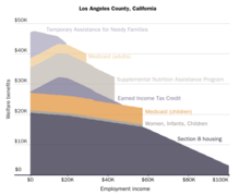
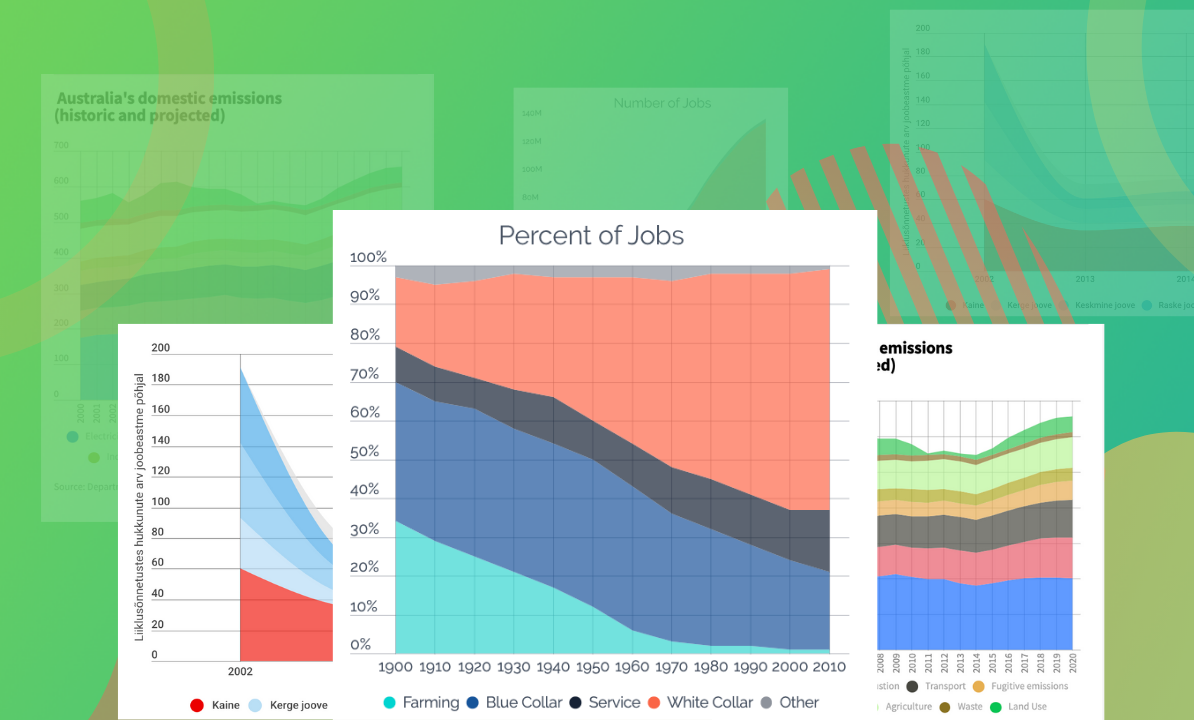
An area chart (also called an area graph) is essentially a line graph with the area below the line filled in. A simple area chart is drawn by plotting data points on a cartesian coordinate grid, then joining a line between the points, and finally filling in the space below the completed line. The area between the axis and the line can be filled in and emphasized with colors, textures, and hatchings.

With Infogram, you can create professional area charts for your business or organization in a wide variety of industries, including media, e-commerce, fashion, entertainment, retail, non-profit, and more. Choose from a variety of templates created by our designers. Add icons, text, adjust colors, and bring meaning to your next great idea to engage your audience from the first glance. 

Read on to learn more how to create an area chart using our tool. Don't worry, we're handling the complicated pieces, allowing you to focus on making engaging, interactive, and educational content that makes an impact.  

Everybody Love Infogram

Many of our clients are excited by the service that we deliver.
Read about what some have said about us.

“ With Infogram we turned our service reporting into the cutting-edge category and receive amazing feedback from the user community. ”

Andreas Igler

Andreas Igler
Director of IT & Operations

“ I’m a data nerd, so I love tools that help readers better visualize information. We use a tool called Infogram at TechCrunch for data visualization. It’s super-easy to use, and you don’t have to be a data analyst or graphic designer to use it. ”

Travis Bernard

Travis Bernard
Director of Audience Development

“ Infogram has taken our stats to the next level. It's great to be able to upload a spreadsheet and turn it into a beautiful interactive piece for our clients to enjoy. ”

Kris Carpenter

Kris Carpenter
Director of Marketing

Browse all area chart templates

Want to get started right away and create an area chart? Choose one of our ready-made templates to stand out from the sea of “meh” content. Keep it simple and create a professional-looking area chart in seconds. View templates

Column Chart
Column Chart
Line Chart
Line Chart
Table Chart
Table Chart
Pictoral Bar Chart
Pictoral Bar Chart
Radial Chart
Radial Chart
Semi circle Chart
Semi circle Chart
Funnel Chart
Funnel Chart
Column Stacked Chart
Bar Chart
Bar Chart
Pie Chart
Pie Chart
Wordcloud Chart
Wordcloud Chart
Doughnut Chart
Doughnut Chart
Pictoral Chart
Pictoral Chart
Column Grouped Chart
Bar Stacked Chart
Bar Stacked Chart

Frequently asked questions

How do I register an account?

Click on the Get started button in the top right corner of the homepage.

Sign up with Google, Facebook, or email. If you choose to sign up with Google or Facebook, simply login to your account when asked to do so. If you wish to sign up with your email address, enter the email and your desired password, then hit the Sign-up button.

Provide some basic information about yourself. Enter your first and last name, indicate what kind of organization you belong to, and specify your role. You will then be able to continue with the Basic plan or choose from any of the available paid plans. View more

When to use area charts?

Rather than conveying specific values, area charts are an ideal choice if you want to display:

1. Change over time

2. Overall trends

3. Continuity across a dataset 

So, if you want to emphasize trends by showing the development of quantitative values over intervals or time periods, an area chart is the go-to graph type in this case. 

It's important to keep in mind that while area charts may function the same way as line charts, the space between the line and axis is filled in, indicating volume.

How to create an area chart?

Infogram's chart creator allows you to easily create professional area charts in just 5 steps:

1. Log in to Infogram

2. Select an area chart type (area, stacked area, stream area, 100% stacked area, or stepped area chart)

3. Upload or copy and paste your data

4. Customize the labels and adjust the design by changing the background, colors, and fonts

5. Download your area chart, add it to your report, infographic, embed it on your website, or share it on social media.

Infogram is super easy to use and made with non-designers in mind. Even if you don't have any programming, coding, or design experience, you'll be able to make area charts in just a couple of steps. 

We did all the technical work for you. Now, all that's left to do is start creating.

Can I use charts for social media?

Getting people's attention on social media can be tough. Adding charts, maps, icons, and other design elements is a great way of getting noticed online. Infogram makes it easy to create beautiful and memorable social media posts with charts to display your important data and statistics. Learn more

How do I change the background of my project?

To access background settings, click on the canvas without selecting any objects. Head over to the settings panel on the right where you can change the image, add filters, and alter image transparency and blur

What are best practices for creating area charts?

Here are some general tips to keep in mind to create an area chart like a superstar:

1. Make the chart easy to read and avoid occlusion. This happens when one or more layers covers important information on the chart.

2. Use stacked area charts if you have multiple data sets and want to emphasize part-to-whole relationships.

3. Look at the bigger picture. Take population, for example: Line charts are good for showing the net change in population over time, while area charts are good for showing the total population over time.

4. Avoid comparing too many datasets. Instead, use a line chart, it will make your project look cleaner.

5. Use labels and legends. This will give your DataViz project the proper context.

Didn't find the answer? Check our FAQs