15.02.2017 by roberts
Color design is hard to get right, so let’s go over a few simple ways to make it easier. First, I’d like to reference this quote:
“To use color well is as difficult as for a fish to pass from water to air or earth.” – André Lhote
This statement may be hyperbolic, but not really. Color is one of the hardest things to master in design. It is also critically important. When the color is off, an otherwise well-executed design can become cringe-worthy.
Color design impacts perception
Consider Vincent van Gogh’s original ‘Starry Night’ on the left and the quickly Photoshopped version on the right. Just the simple act of changing the hue of one of the most famous and beloved paintings in the world can turn it into a terrible mess.

Some graphic designers are not very good with color, by the way. They may excel at designing a layout, typography (which has its own long list of challenges) and conceptualization, but many don’t have the color sense to pick palettes that blend perfectly and enhance a design to perfection.
OK, so color is hard. Boo hoo, right? Get over it and do your best. I understand.
Those of us who aren’t great color theorists and don’t have that special talent often beg, borrow and steal palettes from our clients’ brands, or from websites like Adobe Color and similar tools. But this alone doesn’t address the particular issues we face when choosing colors for data visualization.
Why color is important in dataviz
Color is super important in dataviz for a variety of reasons that go beyond regular design challenges:
-
- We are communicating information where the relative position/size/shape/transparency of an object is telling us something – color affects how we perceive these traits.
- Data visualization is all about pre-attentive attributes. Your audience needs to see these differences ‘at a glance’ and color can impact this.
- Given the above, color in data visualization is as much about contrast as it is about hue, so you have to address contrast before worrying about hue.
How do we meet these challenges?
The first and most important thing to do in any visualization project is to eliminate all color. If you start with the color grey (or a similarly non-committal, light color that blends with your overall palette – perhaps a beige or blue), then you can add color only where necessary to highlight and enhance your data message.
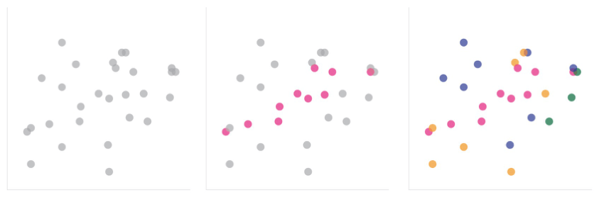
For instance, below we have a few variations of a scatter plot. Which one does a better job communicating data? Of course, that is a subjective question, which depends on what I’m really trying to show.
Even without an objective answer, I would argue the second option wins every time because at least I am communicating something, rather than just throwing spaghetti at the wall to see what sticks. There’s a focus inherent in the second option that clearly draws your eye to what is important, when compared to the other two options.
Would you like to experience the full power of data visualization? Try Infogram for Teams or Enterprise for free! With a Team or Enterprise account, you can create up to 10,000+ projects, collaborate with your team in real time, use our engagement analytics feature, and more. Request your free demo here.
How to find a color palette that works
Sometimes you can’t just have grey plus one color. In those cases, how do you find a palette that works, assuming you can go outside of a strict corporate color palette? Two of my favorite resources are Colorbrewer, whose tagline is ‘color advice for cartography’ but works for any visualization, and I Want Hue, whose tagline is ‘color for data scientists.’
Colorbrewer allows you to select multiple colors using a range of parameters, including sequential, diverging or qualitative palettes (check the site out to understand what that means) as well as enabling you to pick color-blind and print-friendly colors.
I Want Hue gives you the option to generate a palette that is optimized for visualization. You can create very large palettes with as many colors as you like (though I would argue that any palette with more than a handful of colors will do more harm than good) and you can also ensure your palette is color-blind friendly.
Key color tip takeaways
Color is critical to a successful visualization project, so use as few colors as you can, starting with a focus on contrast before color, utilize greys (or similar) heavily and use one of the above palette generators to pick the few colors you want to use to communicate successfully with your audience.
Bill Shander is the founder of Beehive Media, a Boston-based data visualization and information design consultancy. He teaches data storytelling and infographics in workshops around the world. See upcoming cities and dates to register now!
Get data visualization tips every week:
New features, special offers, and exciting news about the world of data visualization.