05.10.2016 by Anete Ezera
We currently live in the age of infographics and data visualizations. Chances are you see information graphics every day during sports games, on health apps, watching election coverage, reading business reports, or decoding transit maps.
These visualizations are so prevalent because infographics are the perfect blend of data, design, and storytelling. They make it easy to share complex information in just seconds. In fact, infographics are liked and shared on social media 3X more than other any other type of content. But, these graphics didn’t just appear overnight. They have a rich history dating back tens of thousands of years.
Let’s explore the early days of ancient infographics and meet the key players that brought data information design into our modern day lives:
Ancient Graphics
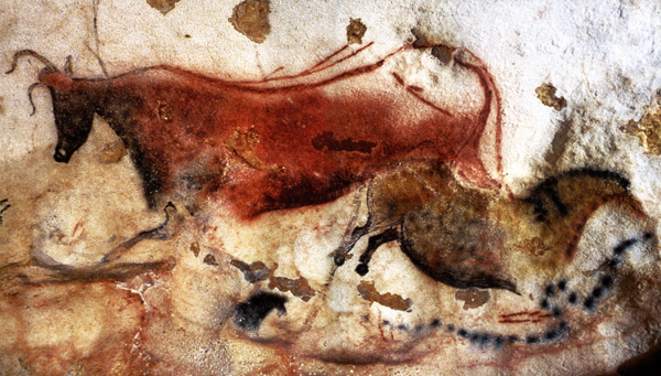
Cave Paintings
Many people consider cavemen to be the first infographic designers. They were the first to turn everyday life into images depicting births, battles, wildlife, deaths, and celebrations. One of the more famous cave painting sites was discovered in France. The Lascaux paintings are estimated to be around 17,300 years old.
Egyptian Hieroglyphs
Egyptian hieroglyphs were a formal writing system used by the ancient Egyptians that used symbols to illustrate words, letters, and concepts. They were a unique but widely used and accepted form of communication, dating back to 3000 BC. These hieroglyphs mainly depicted life, work, and religion.

Early Players
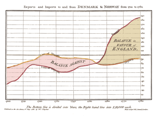
William Playfair
William Playfair is considered the father of statistical graphics, having invented the line and bar chart we use so often today. He is also credited with having created the area and pie chart. Playfair was a Scottish engineer and political economist who published The Commercial and Political Atlas in 1786.
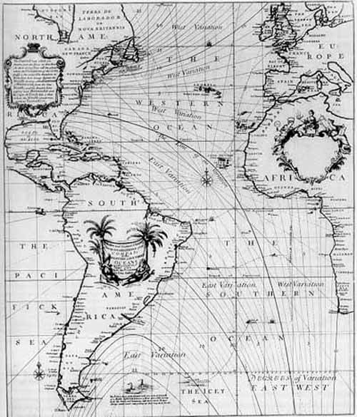
Edmond Halley
Edmond Halley was an English astronomer, geophysicist, mathematician, meteorologist, and physicist who is best known for computing the orbit of Halley’s Comet. Halley developed the use of contour lines on maps to connect and describe areas that display differences in atmospheric conditions from place to place.
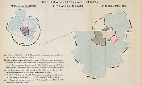
Florence Nightingale
Florence Nightingale is famous for her work as a nurse during the Crimean War, but she was also a data journalist. She realized soldiers were dying from poor sanitation and malnutrition, so she kept meticulous records of the death tolls in the hospitals and visualized the data. Her ‘coxcomb’ or ‘rose’ diagrams helped her fight for better hospital conditions and ultimately save lives.
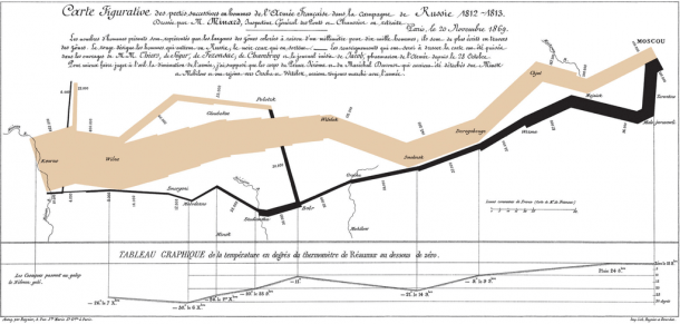
Charles Joseph Minard
Charles Joseph Minard was a French civil engineer famous for his representation of numerical data on maps. His most famous work is the map of Napoleon’s Russian campaign of 1812 displaying the dramatic loss of his army over the advance on Moscow and the following retreat.
20th Century
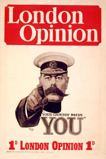
Alfred Leete
Alfred Leete was a British graphic artist whose work used many of the visual and data elements we see in infographics today. As a commercial artist, he designed multiple posters and advertisements, most notably his famous wartime propaganda for the London Opinion.
Otl Aicher
Otto “Otl” Aicher was a German graphic designer and topographer best known for designing pictograms for the 1972 Summer Olympics in Munich. His simplified pictograms became a universal form of communication, appearing on many street signs we see today.

Peter Sullivan
Peter Sullivan was a British graphic designer best known for infographics he created for The Sunday Times in the 1970’s, 80’s, and 90’s. His book Newspaper Graphics is still one of the few books focusing on information graphics in newspapers.

Modern Day
Edward Tufte
Edward Tufte is a statistician and artist, and Professor Emeritus of Political Science, Statistics, and Computer Science at Yale University. He wrote, designed, and self-published 4 classic books. He is considered the father of modern data visualization.

David McCandless
David McCandless is a British data-journalist and information designer based in London. He is the founder of the hugely popular visual blog Information Is Beautiful. He also published a successful book of the same name.
Amanda Cox
Amanda Cox is the new editor of The Upshot, a data-centric site from the New York Times. Amanda joined the Times as their graphics editor in 2004. She is responsible for some of the most innovative work the Times has done over the last decade.
Charts and infographics have fully invaded our digital lives. Tools like Infogram make it easy to create beautiful, interactive infographics of your own. Feel free to chat with our team and see what Infogram has to offer for yourself.

Get data visualization tips every week:
New features, special offers, and exciting news about the world of data visualization.