19.01.2017 by Anete Ezera
Data journalists, scientists, and tech professionals pulled out all the stops last year when it came to creating incredible visualizations. We experienced an explosion of small high-quality publications and emerging technologies, pushing the boundaries of individual creativity and visualization design.
We’d like to share our list (in no particular order) of the best data visualizations of 2016:
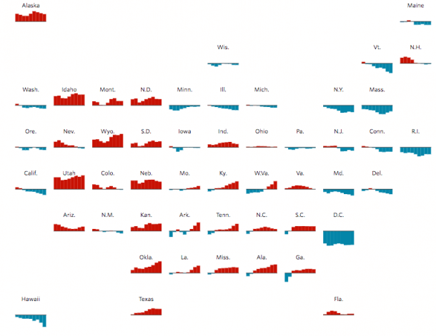
1) A Field Guide to Red and Blue America
The U.S. presidential election brought many surprises in 2016, along with some fantastic visualizations. This graphic from The Wall Street Journal offers a look at how Republican or Democratic each state has been from 1980 to 2012.
2) The Panama Papers
The Panama Papers involved an unprecedented leak of 11.5m files from the database of the world’s fourth biggest offshore law firm, Mossack Fonseca. The explosive documents revealed how the rich and powerful are hiding their wealth in tax havens around the world. Explore the graphs from ICIJ.
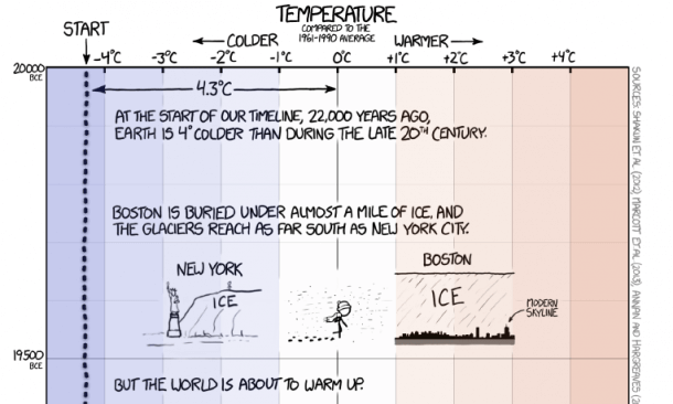
3) Earth Temperature Timeline
This timeline of Earth’s average temperature by Randall Munroe of XKCD is the perfect combination of data and comedy. It even won gold in the ‘Data Visualization‘ category at the 2016 Kantar Information is Beautiful Awards.
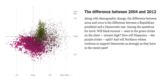
4) The Voting Habits of Americans
Nate Cohn and Amanda Cox made a series of interactive visualizations for The Upshot showing the voting habits of various demographic groups. They did a great job of visualizing the shift from 2004-2012.
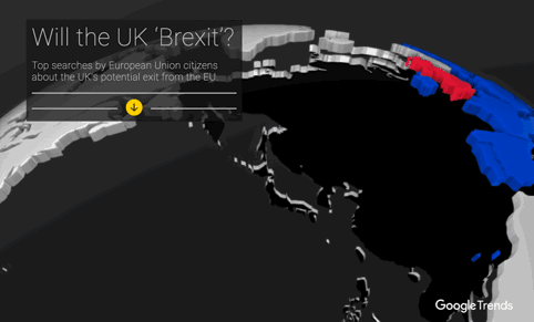
5) Brexit in Virtual Reality
Virtual Reality is a powerful tool in making journalism more immersive to its readers, which is why Google News Lab created a VR project about Brexit – featuring the top searches by European Union citizens about the UK’s potential exit from the EU.
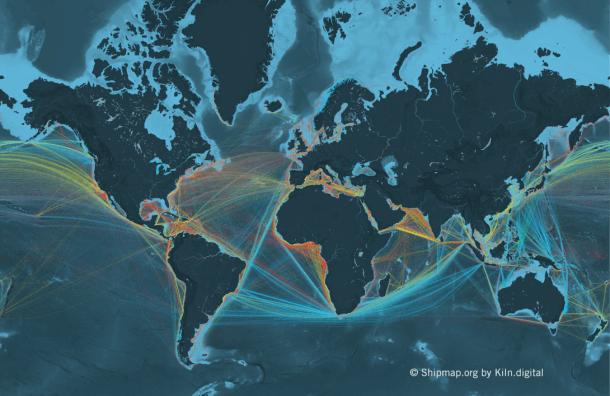
6) Commercial Shipping Movements
Shipmap.org is an ambitious interactive WebGL map of commercial shipping movements based on hundreds of millions of data points from throughout 2012. It won gold in the ‘Interactive‘ category at the 2016 Kantar Information is Beautiful Awards.
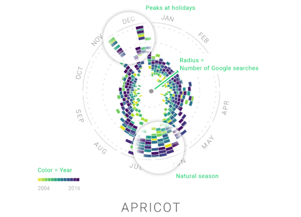
7) The Rhythm of Food
Google News Lab and Truth & Beauty researched how we search for food. Their fun interactive charts reveal key food trends over the years. Have fun exploring the popularity of various diets, foods, and beverages from 2004-2016.
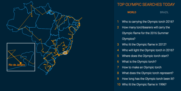
8) Rio Olympics 2016 Search Trends
Google Trends offered creative up-to-the-minute coverage of the 2016 Rio Olympic games. You can view the trends of specific sports and athletes, as well as quirky visualizations about medal standings and the location of the Olympic torch.
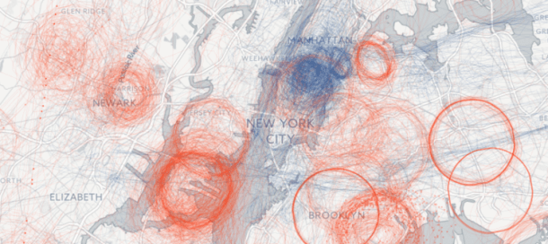
9) Spies in the Skies
Buzzfeed’s Peter Aldhous and Charles Seife won the prize for ‘dataviz of the year‘ at GEN’s 2016 Data Journalism Awards for their project on light aircraft and helicopter surveillance over America. Spies in the Skies is a great example of the depth visualization can bring to a story.
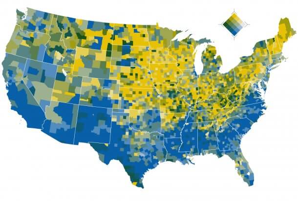
10) Diversity in America
This map from The Washington Post shows the increasing level of diversity in the United States of America. Racial and ethnic diversity varies greatly across the country, but rapid change appears to be coming to many of the least-diverse areas.
Are there any amazing data visualizations we missed? We want to hear from you! Reach out to us on Facebook and Twitter to share your favorite projects from 2016.
Would you like to experience the full power of data visualization? Try Infogram for Teams or Enterprise for free! With a Team or Enterprise account, you can create up to 10,000+ projects, collaborate with your team in real time, use our engagement analytics feature, and more. Request your free demo here.
Get data visualization tips every week:
New features, special offers, and exciting news about the world of data visualization.